How to Design your Custom Safety Scoreboard Online - Tutorial
One of the biggest benefits with ordering a sign from Cousign is the ability to easily and effectively communicate your design requirements to us by modifying any of our existing designs to fit your needs. With our online designer you can add your own logos or team names with a few clicks and key presses, and you'll always know exactly what you are getting.
In this tutorial I am going to cover some of the most common features of our online designer.
Find a sign in our catalog
The first step in customizing my sign is to find a sign in the catalog that has all the features I am looking for. I'm not worried about the exact look of the sign at this point, I just want to find a starting point that has the correct physical size and has all the right types of displays that I am looking for. These are things the designer will not allow me to change, so it's important I choose the right sign to start customizing.
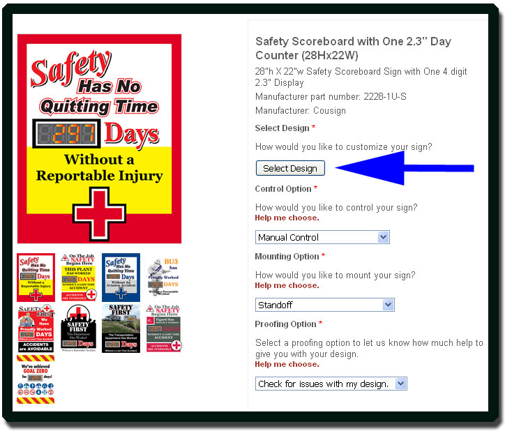
In this tutorial I have chosen the 28Hx22W safety scoreboard with a single 2.3" day counter display. To start customizing I am going to click the 'Select Design' button on the product page.
Choose a design as a starting point
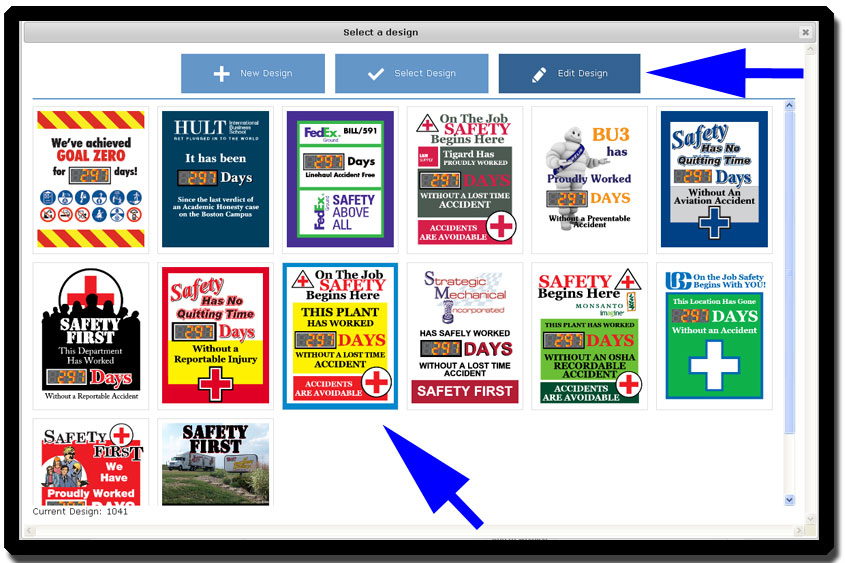
After clicking the 'Select Design' button on the product page, I am presented with a selection of existing designs. If I was so inclined I could simply click on the design that interests me and then choose 'Select Design'. This would allow me to order that design without any changes. If I was feeling really adventurous I could choose 'New Design' which would give me a completely blank canvas to work with. The fastest option is to pick a design I like and use it as a starting point by clicking 'Edit Design'
For the sake of this tutorial I am going to assume that I like one of the designs, but I want to add my team name. First I click the design I am interested in editing, and then I click 'Edit Design'.
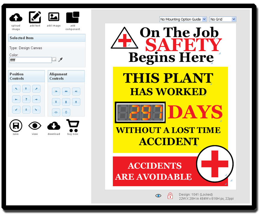
After clicking 'Edit Design' the designer loads and I can start modifying design elements to suit my needs.
Make your changes to text, graphics, and placement
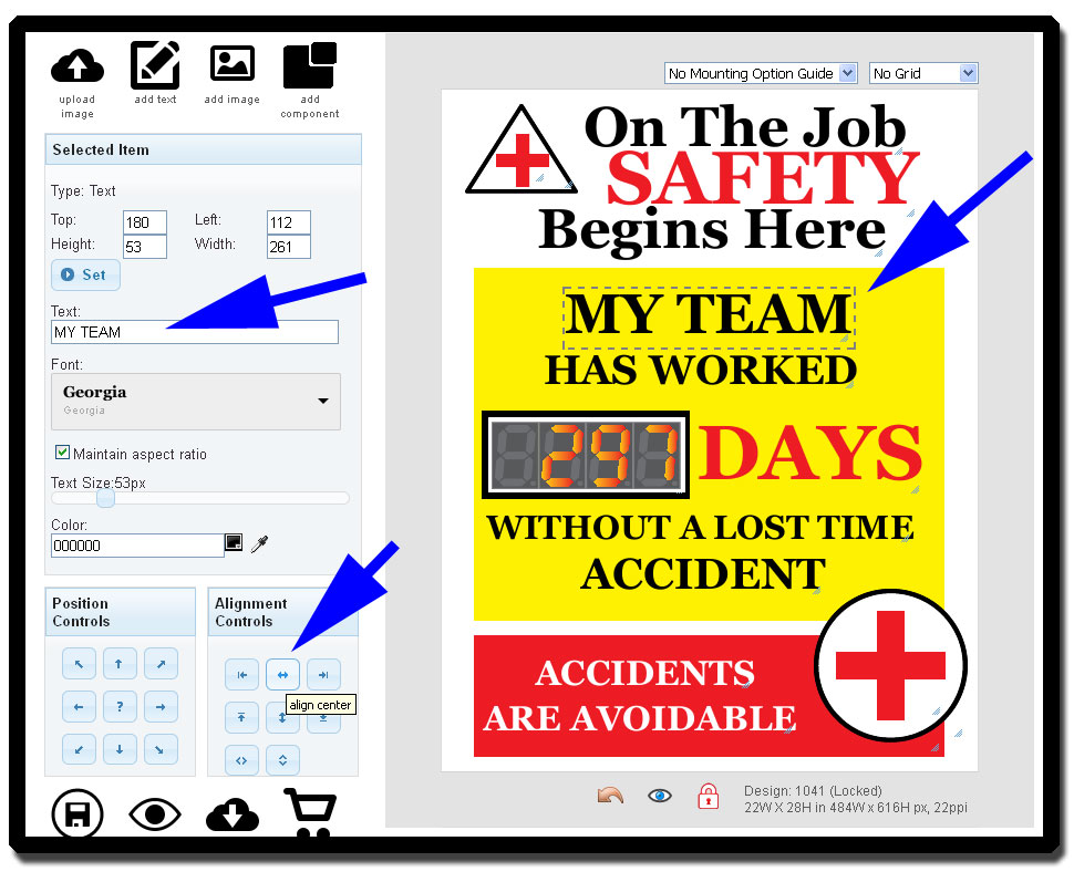
I want to change the text that says 'THIS PLANT' to 'MY TEAM' so I simply click on the text I want to change. Once it is highlighted I can enter my new text in the text box to the left. After I type 'MY TEAM' into the text box it isn't centered anymore so I click the 'Center Align' button and presto my sign is updated.
See exactly what your sign will look like
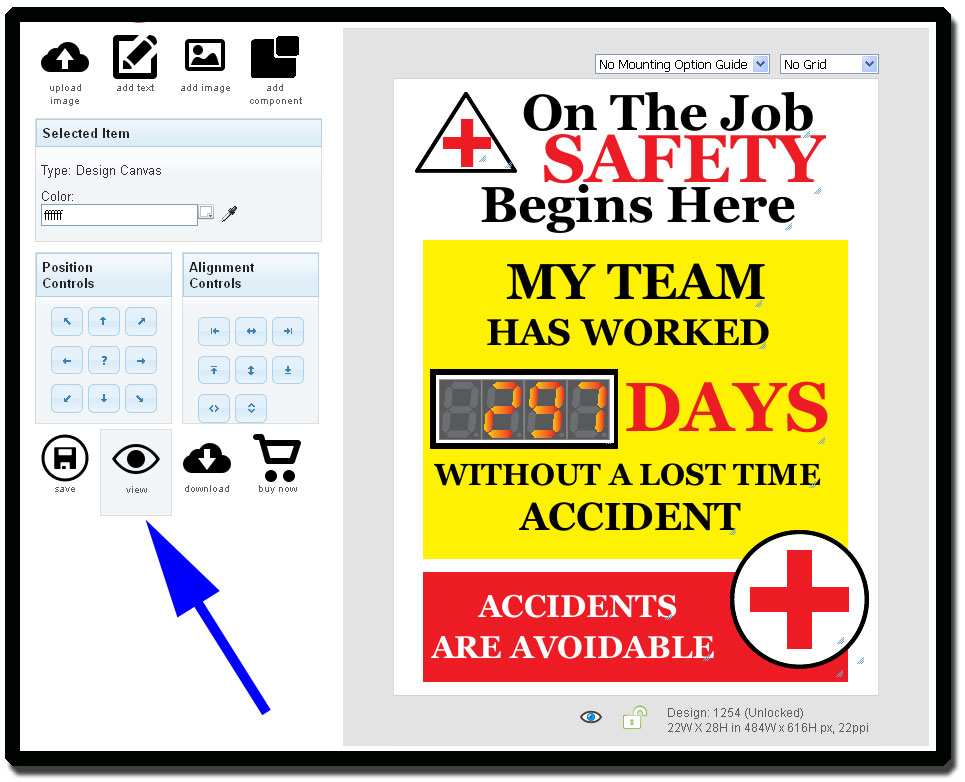
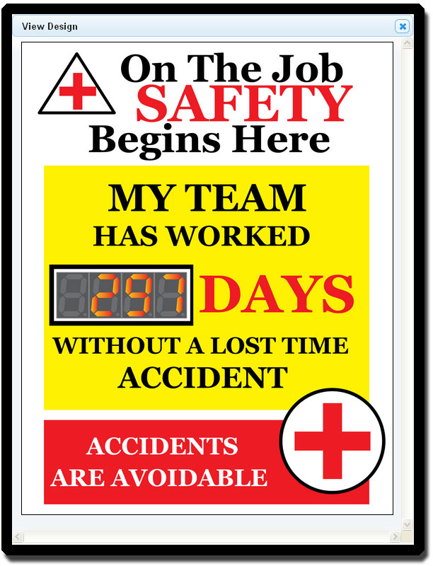
Inside the designer it can be hard to get a good idea of how your sign will look when printed because there are a lot of resize tags and various other design related tidbits all over the screen. I can click 'View' at any time to take a look at the printed view of my sign.
Here it is. My days without a lost time accident sign as it stands right now.
Save, View, Download, or Order your custom days without accident sign at any time
In the lower right hand corner of your design screen you'll see several buttons as shown below.
The 'Save' button allows you to save your work at any time during the design process. If you wish to get a portable version of your design, perhaps to take to a meeting for approval you can click the 'Download' button to get a PDF render of your sign. If you like what you see and are ready to order click the 'Buy Now' button. You'll be taken right back to the product page where you started this process but instead of the stock image you started with you'll see your new design as the product picture.
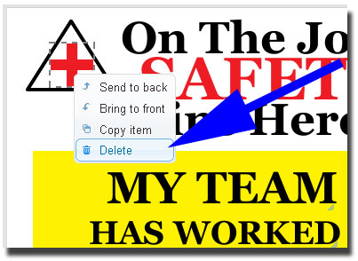
Lets assume I want to do a little more with this sign before I am ready to order. I want to add my company logo. With this design I can grab some space for my company logo in the upper left hand corner by deleting the triangle and cross. So I start by right clicking each and choosing delete. I could have also used the DELETE key on my keyboard after selecting the item.
Upload company logo or other custom graphics
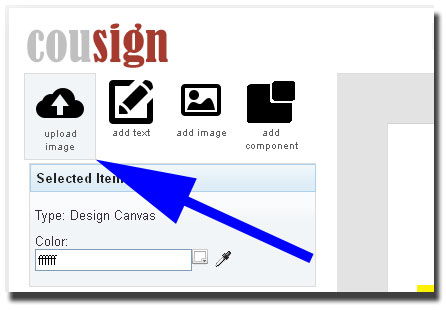
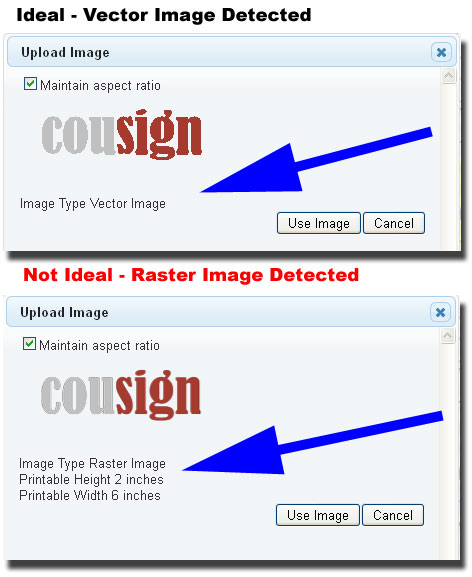
It's best to upload an image in vector format. The preferred format for this is .eps but .pdf will sometimes work as well. I say sometimes work because .pdf files will allow you to store an image in vector or raster format. Vector files store information in a way that allows them to be printed at any size where as raster files lose their luster the larger they get. Because I want my logo to be quite large on the finished sign, the file format is critical to my end result. After uploading my logo the designer will tell me what format it is and give me guidance on how big I can make it on the sign and still have it look ok.
After I have uploaded my new image the designer will place it in the upper left hand corner of the sign.
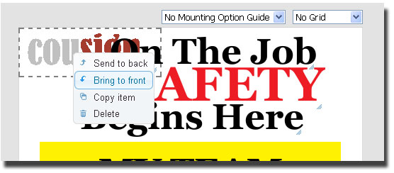
You might have trouble manipulating your image if there are other elements blocking it on the screen. To solve this simply right click on your element and choose "Bring to Front" this will make sure it is on top of any other elements on sign and can be easily manipulated.
Dealing with Raster Images in the designer
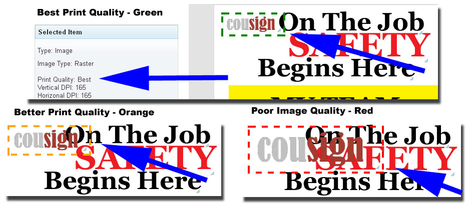
I am going to talk a little bit about how to handle raster images in the designer now. If you have uploaded a vector file you can skip ahead. If you have uploaded a raster image at this point you will see a colored bounding box around your graphic. This will not show up in the final design but it gives you a visual cue as to how big the particular image can be made on the sign and still have reasonable print quality. A green box is best, yellow better, and red signifies unprintable at that size.
You will notice as I make my raster logo bigger, the print quality goes down. If I wanted my logo small as in the first picture, the designer is letting me know it will still look good by putting a green box around it. However, as I make it bigger, the red box lets me know I can't get away with making it that big.
If you have a red box around your image at the desired size you can still order your sign and we will follow up with you to get a higher quality graphic to generate your final proof. Our designers have several options for working with lower quality images and still making them look great. If something isn't going to look great, we'll let you know about it in the proofing process.
Vector Image Uploaded
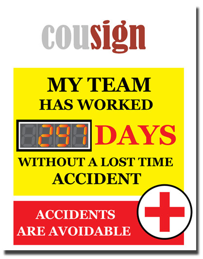
So now lets assume I was able to obtain a vector image of my logo to use for this design. I just delete my low quality raster image and upload my vector based logo. Now I can make my image as big as I want it and it will look great when printed. After playing around a little bit I can resize and modify text until I come up with this design.
Make sure your design works with your mounting option
One of the reasons we recommend always choosing a proofing option of 'Check for issues with my design' is because our designers will check to make sure your design still looks great when its mounted with your chosen mounting option. The last thing I want is a standoff in the middle of my logo or a frame overhang blocking something important!
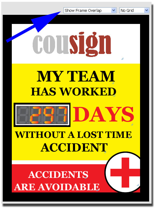
Let's assume I am planning to mount my sign in an exterior enclosure so lets check how it looks inside the frame. In the upper right hand corner there is a dropdown for displaying the mounting option guides in the designer.
When I choose 'Show Frame Overlap' I see the following.
Everything looks good to me. Nothing critical is being blocked by the frame. At this point I could get really critical and move the 'Accidents are avoidable' text to look a little better and play around with the circled plus graphics, but this is for demonstration purposes and I won't actually be printing this sign. I am ready to order! I can click 'Buy Now' to go to the product page for this item and it is ready to add to my cart.
After you place your order, you can expect to see a design proof within about one business day.
Designer Tools and Shortcut Features
Undo - CTR-Z
If you ever want to undo your previous action just click the undo arrow at the bottom of the design window or press CTRL-Z. Your last action will be undone and you can use it as many times as you need to in order to restore your sign to a previous state.
Shortcut Keys
Many of the designer functions are available with standard shortcut keys. They are as follows:
- CTRL-C to copy the selected element(s).
- CTRL-Z to undo an action
- DEL to delete selected item(s)
Multiple Element Selection
You can select multiple items on the design by holding down the CTRL button when clicking on them. You can then copy, delete, move, or use the alignment tools on the selected items at once. When using the alignment tools on multiple elements, the elements will first align to themselves and if an alignment button is clicked a second time they will align to the page.
Eye Dropper - Color Selection
If you want to change the color of an element to match your company logo or pull a color from another graphic or element on the page, click the element you want to edit. Click the eye dropper icon to the right of the color setting text box. You'll see the eye dropper icon appear at the bottom of the design and the cursor will change to a cross hair. Move the cross hair over the desired color and click once. The color of your chosen element will now update. This is a great feature to use when you want a design box or text block to match your uploaded company logo.
Grid Selector
The grid selector in the upper left hand of the design window allows you to choose various snap to grid sizes that will allow you evenly space and align elements. Use with caution as when you activate the grid all items on your design will snap to coordinates on the grid. If the desired behavior is not what you wanted, use the undo button or CTR-Z to go back to where you started.


